Your restaurant website isn't just a digital business card, it's your most powerful revenue driver.
The numbers tell the story. 77% of customers research a restaurant's website before dining out [12], making that first digital impression critical to your bottom line. More concerning: 70% of those potential guests will choose not to visit based on what they encounter on your site [2].
Digital ordering has moved from nice-to-have to essential. Restaurants with online ordering now generate an average of 34% of their revenue through digital takeout and delivery channels [1]. Even better, 67% of consumers actually prefer ordering directly from a restaurant's website rather than third-party platforms [1], which means they want to give you their money without the middleman.
For operators watching margins shrink, 38% didn't turn a profit last year due to rising costs [3], a well-designed website represents real opportunity. Smart restaurants are responding: 31% are implementing online ordering, 24% adding mobile capabilities, and 38% building loyalty programs [3].
The mobile reality can't be ignored.
Customers search for restaurants, check hours, browse menus, and place orders primarily on smartphones. When your website loads fast, displays clearly, and makes ordering simple, you create the frictionless experience that turns browsers into buyers [4]. Get it wrong, and they're gone, likely to a competitor whose digital storefront actually works [5].
The features that follow aren't just best practices. They're profit drivers.
Your website is your digital storefront. Period.
Just like your physical location, it's where first impressions form and hungry customers decide whether to order. But unlike your brick-and-mortar space, your website works 24/7, capturing orders while you sleep and converting browsers into buyers without requiring staff.
Modern diners expect more than basic information. They want the same frictionless experience they get from major brands: fast loading, simple ordering, clear menus.
The restaurants winning online share common elements. These features don't just look good, they work together to create a seamless path from "I'm hungry" to "Order placed." When done right, they turn your website into a revenue-generating machine that captures more direct orders and builds lasting customer relationships.
Here's what actually drives results.
Answer header: Strong ordering CTAs reduce confusion and increase conversions by making the next step obvious the moment customers land on your site.
Your website visitors arrive hungry and ready to order. Without clear direction, they leave. Calls to action are the visual signposts that guide customers straight to checkout, and restaurants implementing strategic CTAs see measurable lifts in online orders and reservations [6] [8].
Weak vs Strong CTA Paths
• Weak: “Menu” link buried in navigation → multiple clicks → customer bounces
• Strong: “Order Online” button visible instantly → direct to ordering → order placed
That's where effective calls to action come in. These visual signposts eliminate confusion and guide customers straight to checkout. The impact is measurable: strong CTAs increase conversion rates by 83% compared to websites with unclear ordering paths.
First-party ordering through your own website delivers serious advantages over third-party platforms. Complete control over the customer experience, plus 15-30% savings on every order by avoiding marketplace commission fees.
The choice is simple: direct customers to your ordering system, or watch them leave for a competitor who makes it easier.
CTAs that convert follow specific design principles:
• Contrasting colors that make buttons impossible to miss [9]
• Action language like “Order Now” or “Start Order” that sets clear expectations [9]
• Large tap targets for mobile users (no precision tapping) [9]
• Consistent placement (header + hero + menu sections) [11] [12]
• Whitespace and clarity that prevent clutter and focus attention [9]
Every extra click reduces conversion rates by up to 20% [10]. Link CTAs directly to your ordering menu or checkout, not an intermediate page.
Real restaurants show how this plays out:
Soho House used location-specific CTAs like “Reserve in Shoreditch,” resulting in a 39% increase in reservations [8].
Outback Steakhouse positioned “Sign Up for Offers & Rewards” with immediate value rather than a generic newsletter pitch [7].
Farm Burger improved conversion by using a form CTA instead of email links for catering, reducing friction and spam [7].
Smokin' Oak Wood Fired Pizza added prominent "Order Online" buttons and increased digital orders by 30% within two months. Their bright orange buttons contrast perfectly with the website's earthy tones.
Mr. Jim's Pizza implemented floating "Order Now" buttons that follow users as they scroll, resulting in a 25% boost in online transactions. The ordering option stays visible no matter where customers are on the page.
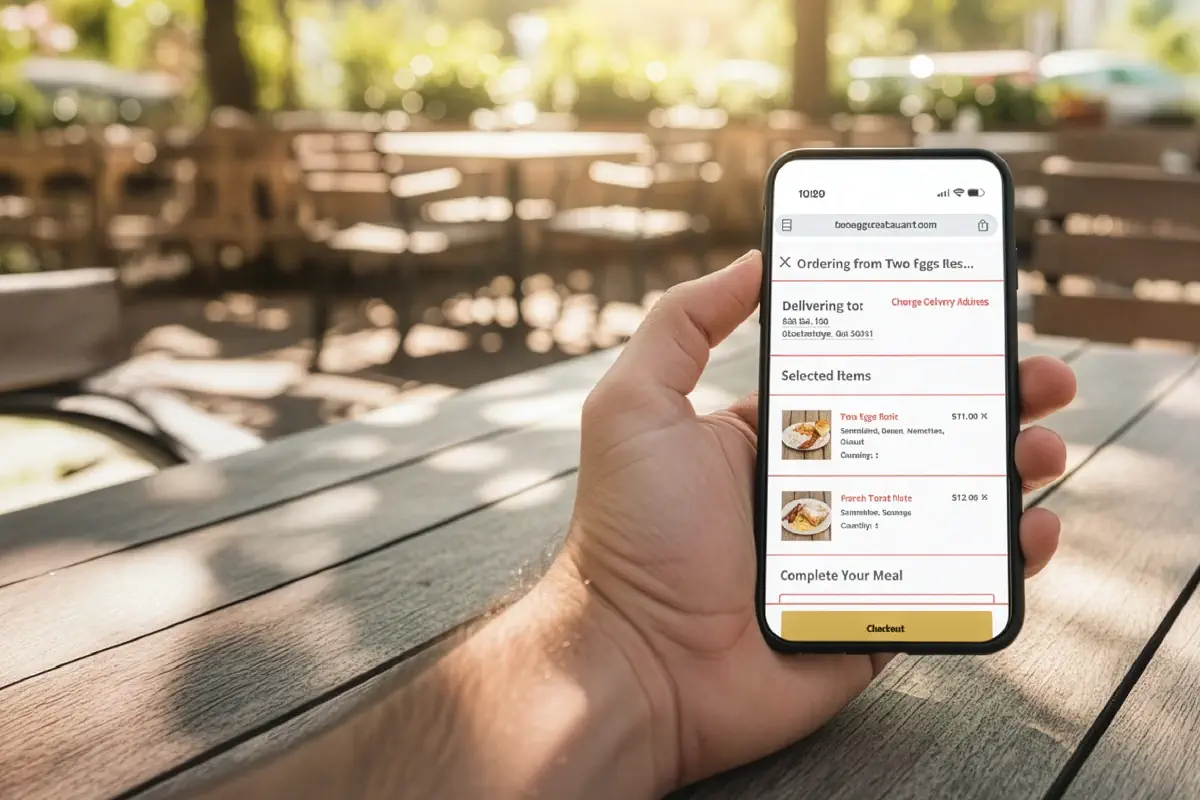
Two Eggs Cafe created separate CTAs for "Order Pickup" and "Order Delivery," letting customers choose their preferred method without extra clicks.
Where CTAs live determines whether people use them:
1. Top navigation keeps ordering visible at all times [11]
2. Above the fold catches fast-deciding visitors [12]
3. Key decision points throughout longer pages guide users like digital staff [13] [9]
Keep CTAs simple. One clear “Order Online” CTA will outperform scattered, competing buttons that confuse customers [11].
Ready to implement CTAs that actually drive orders? Start here.
Hungry customers don’t have patience for treasure hunts. They land on your website searching for basics: hours, phone number, address. Make them work for it, and 44% leave [14].
Best practices:
• Put info in the header and footer [17]
• Make phone numbers click-to-call [23]
• Link address to Google Maps and embed a map [18]
• Maintain accurate hours, including holidays [19]
Test it like a first-time visitor. If you can’t find your own hours and address in seconds, neither can they.
The math is brutal but clear.
Most visitors hit your website searching for the basics: where you are, when you're open, how to reach you [15]. Hide this information behind multiple clicks or bury it in a footer, and you're essentially telling customers to go somewhere else [16].
Your website isn't just a digital brochure, it's your first opportunity to remove friction from the customer journey [16]. Every extra second someone spends hunting for your address is another chance for them to bounce to a restaurant that gets it right.
Think of contact information as your digital storefront sign. If people can't immediately figure out where you are and when you're open, they keep walking.
Make it impossible to miss:
• Front and center placement – Header, footer, or homepage hero section where eyes naturally land [17]
• Complete information including:
Multi-location operators need location-specific details readily available [17]. Nothing frustrates customers more than calling the wrong location or driving to a closed store.
Mobile-friendly contact sections aren't optional, they're essential [14]. Most restaurant searches happen on phones, often while people are already out and deciding where to eat. Outdated hours or wrong phone numbers kill conversions instantly [19].
Some restaurants nail the contact information game:
Yang's Kitchen puts essential information front and center on their website, eliminating any guesswork for hungry customers [20]. Clean, simple, accessible.
Market on Front in Missoula, Montana created a comprehensive contact page that includes everything a potential diner needs without requiring additional navigation [21]. Their approach proves that thorough doesn't have to mean cluttered.
Shade Hotel extends contact accessibility to their email marketing, including complete details in email footers [22]. Smart operators think beyond the website to every customer touchpoint.
Make your phone number clickable and link your address to Google Maps [23]. These small touches create massive convenience for mobile users trying to call or navigate to your restaurant.
Test your contact section like a first-time visitor. If you can't find your own phone number and address within seconds, neither can your customers.
Contact information that works isn't just about convenience, it's about converting browsers into diners and setting the foundation for every order that follows.
Your ordering system is where digital meets operational reality. Restaurant owners implementing direct online ordering report up to 30% savings on marketplace commissions, money that stays in your pocket instead of flowing to third parties [24].
Third-Party vs First-Party Ordering
• Third-party first: You pay commissions and lose customer data
• First-party first: You keep more margin and own the relationship
Direct online ordering systems help operators save up to 30% by avoiding marketplace commissions [24].
Direct online ordering systems create multiple revenue advantages:
• Direct revenue control - Keep 15-30% more per order by avoiding marketplace fees
• Customer data ownership - Build email lists and track ordering patterns for targeted marketing [25]
• Streamlined operations - Orders flow directly to your kitchen without tablet chaos [26]
• Improved accuracy - Digital ordering eliminates handwritten ticket errors [27]
• Revenue growth - Restaurants report 20% sales increases after implementation [28]
The customer preference is clear. 60% of American consumers order takeout weekly, with online ordering growing 300% faster than dine-in [29]. More importantly, 70% prefer ordering directly from restaurants rather than third-party apps [30].
They want to support your business directly.
Building an effective online ordering system requires systematic planning:
Step 1: Platform Selection - Choose between built-in POS systems (Square, Toast), dedicated platforms (Chowly), or custom solutions based on your operational needs [24].
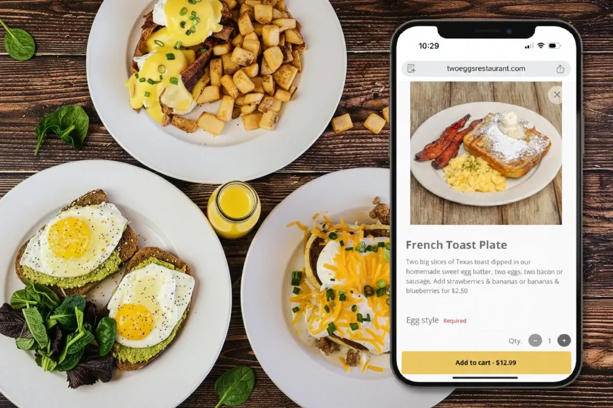
Step 2: Menu Optimization - Create digital menus with high-quality images, clear descriptions, and customizable options. Your online menu should be as appealing as your physical space[28]."
Step 3: POS Integration - Connect your ordering platform directly to your existing POS system. Orders should print in your kitchen without manual re-entry [27].
Step 4: Payment Processing - Offer multiple payment options, credit cards, digital wallets, and mobile payments to accommodate all customer preferences [28].
Step 5: Testing and Launch - Run test orders from submission to kitchen receipt. Verify everything works before going live [28].
The platform should reflect your restaurant branding, creating immediate recognition for customers [31].
Pizza Pirate in Benicia implemented direct ordering and saw their average ticket jump 40% while reducing errors and improving customer experience [30].
The Port of Peri Peri added a simple ordering link to their Google Business profile. Result: $4,000 weekly sales increase [31].
Mocha Nut invested in professional product photography for their ordering system, creating visual appeal that accurately represents their offerings [32].
Fresh Baguette organized their digital menu with clear categories, making navigation simple without overwhelming customers [32].
Ready to capture more direct orders? Start here to implement an ordering system that connects with your operations while giving you complete customer control.
Choose platforms offering real-time tracking, customization options, and transparent pricing for optimal results [32].
Answer header: A searchable, mobile-friendly digital menu increases conversions, improves SEO visibility, and drives higher-ticket orders by removing friction from browsing and ordering.
Your menu decides what customers order, and how much they spend.
Menu selection drives restaurant choice more than any other factor [33]. Yet many restaurants still use PDF menus that force customers to pinch, zoom, and squint.
That's money left on the table.
PDF Menu vs Digital Menu
• PDF menu: hard to read on mobile, not easily searchable, poor UX
• Digital menu (HTML): mobile-friendly, searchable, indexable for SEO, easier to update [34]
What works:
• Logical categories that match how customers think [36]
• Streamlined choices to prevent decision paralysis [37]
• Descriptive language that increases sales (Cornell research cited in your draft) [35] [38]
• Clear dietary icons for faster decision-making [40]
Restaurants with menu photos received 70% more online orders and 65% higher takeout and delivery sales [35].
PDF menus kill conversions on mobile devices. While 41% of consumers prefer ordering directly from restaurant websites [33], mobile users, who represent 50% of all internet traffic, abandon sites that make them constantly pan and zoom through static files [34].
Smart restaurants have moved beyond PDFs to searchable, responsive digital menus. The results speak for themselves:
• Restaurants with photos in their menu received 70% more online orders and 65% higher takeout and delivery sales [35]
• Search engines can crawl digital menus, boosting discovery when hungry customers search for specific dishes [34]
• Strategic layout draws attention to high-margin items, improving profitability per order [36]
The difference isn't just functional, it's financial. Digital menus don't just list food; they sell it [33].
Effective digital menus follow a clear hierarchy:
Organize with purpose. Group items logically, appetizers, mains, desserts, but go deeper. Create sections that match how customers think: "Quick Bites," "Shareables," "Comfort Classics" [36].
Cut the clutter. Too many choices create decision paralysis. Streamlined menus speed up ordering and reduce abandonment [37].
Write to sell. Descriptive language boosts sales by 27% according to Cornell University's Food and Brand Lab [35]. Replace "chicken sandwich" with "crispy buttermilk fried chicken with house-made pickles and spicy aioli" [38].
Design for mobile first. Adequate spacing, readable fonts, and thumb-friendly navigation aren't optional, they're essential for the majority of your traffic [39].
Mark dietary preferences clearly. Icons for vegan, gluten-free, and other restrictions help customers find what they need quickly [40]. Fast decisions mean faster orders.
Online customers can't smell your kitchen or see steam rising from fresh dishes. Your menu copy and photos have to do that work [37].
Several restaurants prove that menu design drives measurable results:
Urth Caffé redesigned their digital menu with rich photography and descriptive copy. Online session length increased nine times [34].
Earls Kitchen keeps it simple with clean typography and appetizing descriptions using words like "crispy," "tender," and "spicy", no photos needed when the copy sells the sizzle [34].
Two Eggs Cafe organized their menu with separate sections for pickup and delivery, eliminating confusion and reducing clicks to order [34].
The most effective menus feel like brand extensions. Colors, fonts, and voice should match your restaurant's personality, creating the digital equivalent of walking through your front door [41].
Menu optimization isn't a one-time project, it's ongoing revenue optimization.
Answer header: Mobile optimization is the difference between “order placed” and “customer lost,” because most restaurant browsing and ordering happens on phones and speed directly impacts conversion.
Your mobile experience determines whether hungry customers place an order or abandon your site for a competitor.
70% of food orders now happen on smartphones [42]. Mobile-first indexing also means your mobile experience affects how easily customers can find you in search [45].
Good vs Great Mobile Experience
• Good: responsive layout + readable text
• Great: fast load + thumb-friendly checkout + click-to-call + instant ordering path
Speed matters: even a one-second load delay reduces page views by 11% [46].
Mobile optimization goes beyond making your site "fit" on a phone screen. It requires rethinking the entire customer journey:
• Responsive design that automatically adapts to any screen size [47]
• Click-to-call functionality for immediate phone orders [48]
• Tap-friendly navigation with finger-sized buttons [49]
• Fast loading times through optimized images and streamlined code [49]
• Mobile-friendly menu that eliminates pinch-and-zoom frustration [44]
• One-handed checkout process [42]
• Prominent ordering buttons visible on small screens [46]
• Integrated maps for instant directions [48]
PDF menus are conversion killers on mobile. HTML-based menus load faster, display clearly, and actually help customers complete orders [44]. The difference shows up immediately in your order volume.
Smart operators have built mobile experiences that convert:
Nobu delivers an upscale mobile experience that loads quickly even on cellular connections, proving you don't have to sacrifice sophistication for speed [50].
PizzaExpress created an intuitive mobile interface with hand-drawn visuals that significantly boosted mobile engagement [50].
In-N-Out keeps it simple and fast, matching their brand while ensuring fast loading speeds that convert hungry mobile users [50].
The pattern is clear: mobile-first design isn't about cramming your desktop site onto a phone. It's about creating a streamlined experience that gets customers from craving to ordering as fast as possible.
Start here to build a mobile experience that captures orders instead of losing them.

Answer header: High-quality food photos increase trust and conversion because customers “buy with their eyes” when ordering online.
Pictures sell food. It's that simple.
Professional food images increase orders by 35% [51]. Menu items with images get measurable sales lifts compared to those without [52].
Professional food photography isn't just about making dishes look good. It's about converting browsers into buyers.
Menu items with images see a 6.5% sales boost compared to those without [52]. Add professional photos to your delivery page and sales jump by at least 30% [52]. Menu conversion rates climb over 25% when images are included [51].
The psychology is straightforward: viewing food pictures matters 1.44 times more than reading descriptions [51]. According to Google research, high-quality food photos rank as the most important content for customers researching restaurants [51]. Customers can't smell your kitchen or see the sizzle, your photos have to do that work.
Great food photography doesn't require a professional studio:
• Natural light wins - Position dishes near windows with indirect light to avoid harsh shadows [53]
• Make it fresh - A light mist of water or oil makes vegetables and salads pop53
• Clean everything - Smudged plates kill the appetite [53]
• Try different angles - Overhead, 45-degree, and straight-on shots tell different stories [53]
• Keep backgrounds simple - Dark surfaces, light walls, or natural wood let food take center stage [53]
The goal isn't Instagram perfection. It's accurate appetite appeal.
Pizza Pirate invested in professional food photography and watched their average ticket value jump 40% [54]. The photos didn't just look better, they drove bigger orders.
Sweetgreen built their entire digital experience around crisp visuals that make healthy food crave-worthy [55]. Their mobile-friendly design puts food photography front and center, turning salads into scroll-stopping content.
Katsuya uses bold typography with full-screen close-ups that showcase every detail of their sushi [56]. The immersive visual experience makes ordering feel inevitable.
Each restaurant proves the same point: when customers can "taste with their eyes," they order with their wallets.
The goal is to remove friction at every step. If customers get stuck anywhere in this path, you lose orders.
Use this as an audit tool before redesigning anything:
Ordering
• Order Online CTA visible in header and hero
• CTA links directly to ordering, not a dead-end page
• Checkout works with one hand on mobile
Menu
• Menu is HTML (not PDF)
• Menu is searchable + mobile readable
• Photos and descriptions support higher-ticket items
Mobile
• Loads fast on cellular
• Tap targets are large and obvious
• Click-to-call is enabled
Trust + Confidence
• Hours and address visible immediately
• Map and directions are one tap
• Brand is consistent (photos, voice, layout)
The most effective restaurant websites don't rely on a single feature, they combine multiple elements that work together to capture orders and build customer loyalty.
Here's how the core features stack up:
| Feature | Key Benefits | Best Practices | Impact Metrics | Implementation Examples |
|---|---|---|---|---|
| Prominent Calls to Action | - Guides visitors to ordering - Reduces confusion - Saves commission fees |
- Use contrasting colors - Action-oriented language - Consistent placement - Appropriate button sizing |
- 83% increase in conversion rates - 15-30% savings on commission fees |
- Smokin' Oak Pizza: 30% increase in digital orders - Mr. Jim's Pizza: 25% boost in online transactions |
| Clear Contact Information | - Prevents visitor abandonment - Converts visitors to customers - Improves mobile accessibility |
- Immediate visibility - Include comprehensive details - Embed Google Maps - Mobile-friendly format |
- 44% of visitors leave if contact info isn't easily found | - Yang's Kitchen: Front-center information display - Market on Front: Clean, comprehensive contact page |
| Integrated Online Ordering | - Direct revenue control - Reduced commission costs - Improved order accuracy - Customer data ownership |
Choose right platform type - Customize digital menu - POS integration - Secure payment processing |
- 20% sales increase in 2025 - 30% savings on marketplace commissions - 60% of consumers order weekly |
- Pizza Pirate: 40% higher average ticket - Port of Peri Peri: $4,000 weekly sales increase |
| Searchable Digital Menu | - Higher conversion rates - SEO improvements - Profit optimization |
- Logical organization - Streamlined options - Descriptive language - Mobile optimization |
- 70% more online orders with photos - 27% sales boost with descriptive words |
- Urth Caffé: 9x increase in session length - Earls Kitchen: Simplified menu with descriptive text |
| Mobile-Optimized Design | - Improved search rankings - Better user experience - Increased conversions |
- Responsive design - Click-to-call functionality - Fast loading times - Simple checkout process |
- 60% of searches on mobile - 50% visit within a day - 11% fewer page views per second delay |
- Nobu: Fast-loading minimalist design - In-N-Out: Simple, straightforward mobile interface |
| High-Quality Visuals | - Increased order rates - Better menu conversion - Enhanced customer appeal |
- Use natural lighting - Clean presentation - Simple backgrounds - Multiple angles |
- 35% increase in delivery app orders - 6.5% increase in menu item sales - 25% higher menu conversion rates |
- Sweetgreen: Crisp visuals with brand alignment - Pizza Pirate: 40% higher ticket value |
The strongest restaurant websites implement all six features as an integrated system. When CTAs guide visitors to a mobile-optimized ordering system with high-quality visuals and clear contact information, conversion rates compound, turning casual browsers into regular customers who order directly and more frequently.
Your restaurant website either drives orders or drives customers away.
The features covered here work together as a conversion system. CTAs guide hungry customers straight to ordering while keeping commission savings in your pocket. Contact information displayed clearly prevents visitors from abandoning your site before they even know where to find you. Direct online ordering puts you back in control, and a searchable menu with photos increases conversion.
Before: Marketplace-First Ordering
You’re dependent on third-party fees, competing side-by-side with everyone else.
After: Direct-First Ordering
You keep margin, own customer data, and build repeat ordering without paying commissions forever.
Audit your website against the checklist above. Pick the biggest gap and fix it first. Each improvement compounds.
• Restaurant websites influence revenue directly, especially when they convert mobile traffic into direct orders.
• Prominent CTAs remove friction and guide customers straight to checkout, improving conversion [6] [8].
• Clear hours, phone, and location prevent abandonment and help customers act fast [14] [19].
• First-party ordering protects margin and customer relationships compared to marketplace-first paths [24] [25].
• Replace PDF menus with searchable digital menus to improve mobile UX, conversions, and SEO discoverability [34].
• Photos and descriptive menu copy increase orders because customers buy visually when ordering online [51] [35].
• Mobile speed and usability determine whether customers stay long enough to place an order [46] [45].